Nissan Interaction Design Team Suffers to Make Future Cars Simple and Painless
It is almost painful to watch Nissan designer Naoki Yamamoto get out of a test car. To understand the challenges aging drivers face, the 39-year-old interaction specialist is encased in a proprietary "aging suit" that gives him the mobility and faculties of a driver twice his age. "Sure, it's uncomfortable," Yamamoto says, "but to really understand a problem you have to feel it in your bones."
At an "Interaction Design Workshop" today at the Nissan Design Center in Atsugi, Japan, Yamamoto demonstrated to reporters one of many methods Nissan's Interaction Design team employs in a continuing effort to make future car interiors easier to understand and more comfortable to use.
Interaction design covers all aspects of the interface between people and cars. How do we understand which knob does what - and how it's supposed to work? Where do we expect to find it? How can one design meet the diverse needs of people big and small, strong and weak all over the planet? And how does the experience make people feel?
Feelings - emotional responses to what people see, touch, hear and smell in a car - are absolutely critical to the success of any design. Feelings are also inherently and frustratingly subjective - which is why quantifying and analyzing them is among the paramount tasks of interaction design. For example, how much resistance feels right when turning a knob? What makes leather feel richer than a synthetic alternative?
Careful observation is vital, and Nissan's interaction designers spend countless hours looking for signs of awkwardness as people interact with their vehicles. When not physically uncomfortable - as wearing the "aging suit" - the work can be mind-numbing. "Some days we watch hours and hours of video of different people doing the same thing," says Associate Chief Designer Etsuhiro Watanabe says. "But the biggest challenge is figuring out what to look for."
Sometimes the remedy can be ridiculously simple - like putting a small arrow by the fuel gauge so rental-car drivers don't have to get out to see which side the tank is on.
But as on-board electronic functions proliferate, interiors become ever more complex and the need for interaction design becomes acute. So in 2005 Nissan created the Interaction Design Team to ensure logic and simplicity are not sacrificed. This move represents a key "Life on Board" initiative in Nissan's four-fold technology strategy. (Safety, Environment and Dynamic Performance are the other three.)
"We're a small team relative to the whole Nissan Design department," Watanabe says. "But consistent with what we call 'the Nissan Way' we work cross-functionally with other teams in Design, Engineering, Product Planning, Marketing and Sales as well as Purchasing. It's hard to know exactly what competitors are doing, but we suspect we're among the leaders in our field. And our results are quickly incorporated in new products."
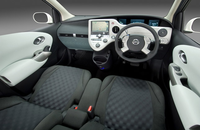
Centerpiece of today's workshop was BUI-2 - as in, "Best Usability Interior" - second-stage prototype of a unique interior concept incorporating leading-edge ergonomic features developed from the Interaction Design team's research efforts.
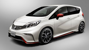
Until you open the door, BUI-2 looks any other current-model Nissan Note. Even once behind the wheel, the interior layout feels so logical and familiar it takes a moment to feel surprised by what you find.
"That's exactly the reaction we want," Watanabe says. "What you see as you get behind the wheel should be instantly understandable and reassuring. You shouldn't need a manual to know what to do next."
The steering wheel itself is the first thing you notice: a compact oval that impedes neither knees nor sightlines to the instrument panel. With spokes linked to the steering column at 4:30 and 7:30 (as on a clock face) fingers find a comfortable grip at 3 and 9 o'clock (the Nissan-recommended posture). And yet palms find no resistance as they slide around the wheel when turning.
Hands need not leave the wheel at 3 and 9 o'clock as all controls on the steering-wheel hub - such as audio and cruise control - are within easy thumb's reach. The left index finger can just as easily operate an electronic gearshift paddle at 10 o'clock. As the eye intuitively follows the finger, gear selections are sensibly displayed right next to the paddle.
Once the car begins to move, the eyes need never travel far. All drive-critical information is clearly displayed within the driver's field of vision, between the top of the steering wheel and the road ahead. Video screens at left and right of the main cluster show what's happening at the front bumper corners with sightlines so natural you might think they were windows. And glare is never an issue thanks to displays shaded by an arched dash.
Peripheral controls such as onboard navigation, climate control and mirror adjustment are laid out with equally intuitive logic: immediately visible, comprehensible and right where you would expect them.
Nowhere is the interaction challenge greater than with two functions that have frustrated generations of car designers: "ingress" and "egress." Getting in and out of a car is physically awkward - especially for today's older and larger users. But the Nissan team's methodical approach is yielding results.
"Egress," getting out of a car, is a complex, multi-step process that involves pulling a small handle, pushing a large and necessarily heavy door, sliding legs sideways, then using arms and legs in an effort to step out and down at the same time.
Nissan's Interaction Design team has focused on the first steps in this process.
"Watch how different people grasp the same door handle," Watanabe told workshop participants viewing a research video. "Men wrap fingers round the latch and push the door out with their elbows. Women use one hand for the latch and push with the other. People approach left and right side doors differently."
"What we observed," Watanabe continued, "is that since fingers approach the latch from several different angles, it has to be ergonomically efficient no matter how you grasp it."
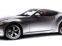
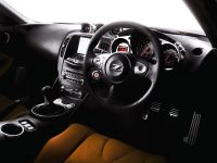
That insight led to the team's simple but elegant oyster-shaped latch design used in BUI-2, and already incorporated in the new Fairlady Z and Nissan Cube.
Going a step further, the team realized users needed a better grip when swinging the unlatched door. That led to an easy-to-grip molded ridge running along the inside of each door parallel to the bottom of the window. Just below the latch is a sculpted knob that can be grasped to swing the door open or shut.
In the ongoing struggle for ease of egress, the Interaction team's latch, ridge and knob comprise a significant advance that will quickly benefit customers.
"Sometimes our painstaking efforts may not be obvious to the customer," says Watanabe. "But our work is very gratifying when we're able to make life on board better for Nissan's customers."
